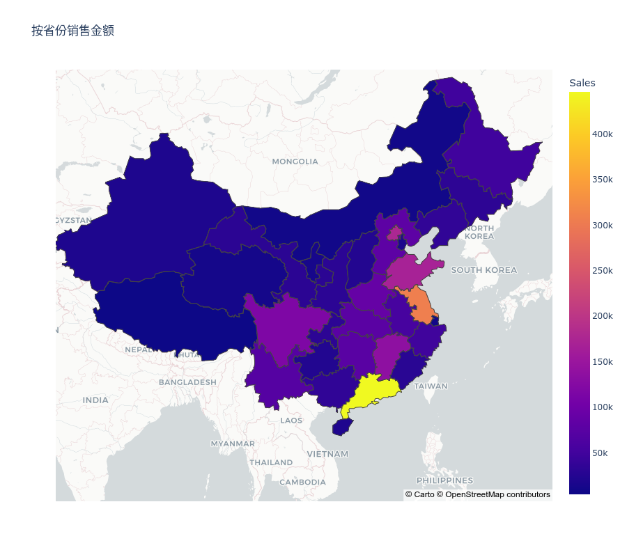
Why Visualize Sales on a Map?
- Instant Insight: A color-coded map can immediately show which regions have the highest and lowest sales.
- Targeted Marketing: Regions with low sales can be targeted with specific marketing campaigns.
- Resource Allocation: Areas with high sales might need more resources, be it stock, staff, or logistical support.
Step-by-step Guide:
-
Gather Your Data:
- Ensure you have a dataset containing sales figures associated with regions or states of the country.
- Make sure this data is cleaned, with missing values handled.
-
Obtain Geographical Data:
- For mapping, you need geographical boundary data. This is often available in GeoJSON format.
- Many countries' boundary data is freely available online. For our example, we'll use China's province boundaries.
-
Set Up Your Python Environment:
- If you haven’t already, install
plotly:pip install plotly
- If you haven’t already, install
-
Load and Process Your Data:
import json with open("path_to_geojson_file.json", "r") as file: geojson_data = json.load(file) -
Visualize the Data:
import plotly.express as px # Group by state/region and sum the sales sum_of_sales = df.groupby('State/Region')['Sales'].sum().reset_index() fig = px.choropleth_mapbox( sum_of_sales, geojson=geojson_data, locations='State/Region', color='Sales', featureidkey="properties.name", mapbox_style="carto-positron", center={"lat": latitude_of_country_center, "lon": longitude_of_country_center}, zoom=appropriate_zoom_level, title="Sales by State/Region" ) fig.show("png") -
Customization:
- You can customize the colors, add hover data, or even integrate other plots.
- Adjust the center and zoom to fit your country of choice.
Example:

Conclusion:
Mapping sales data provides businesses with a visual tool to easily discern regional performance. By leveraging Python and modern libraries like plotly, you can generate these insights with just a few lines of code. As always, the key is in the interpretation – use these visual aids to drive business decisions, allocate resources more efficiently, and ultimately, achieve greater success!

